Cover by SIL
July 2021–present. Launched Nov 2021.
SIL INTERNATIONAL
Figma
Storybook
Building a mutual aid plan to protect personal property of organization employees overseas.
Existing Service
SIL employees live overseas, often in areas where infrastructure is less developed, and rely on technology to do their work. Events like theft or severe weather often pose a significant financial obstacle, so the organization created a mutual aid plan to insure valuable items against events that can jeopardize their work.
In its previous state, the mutual aid plan was limited in capacity. Existing policies were managed by one administrator in a Microsoft Access database originally created in 2003. To start a new policy or file a claim, an employee would email the administrator in charge of the plan, who manually entered the information in the database. Because of the high overhead from this system, the organization had not been able to expand the plan widely among its employees.
The primary goal of this project was to allow more employees to take advantage of the mutual aid plan by creating a web app that allows them to create and manage policies on their own.
Design
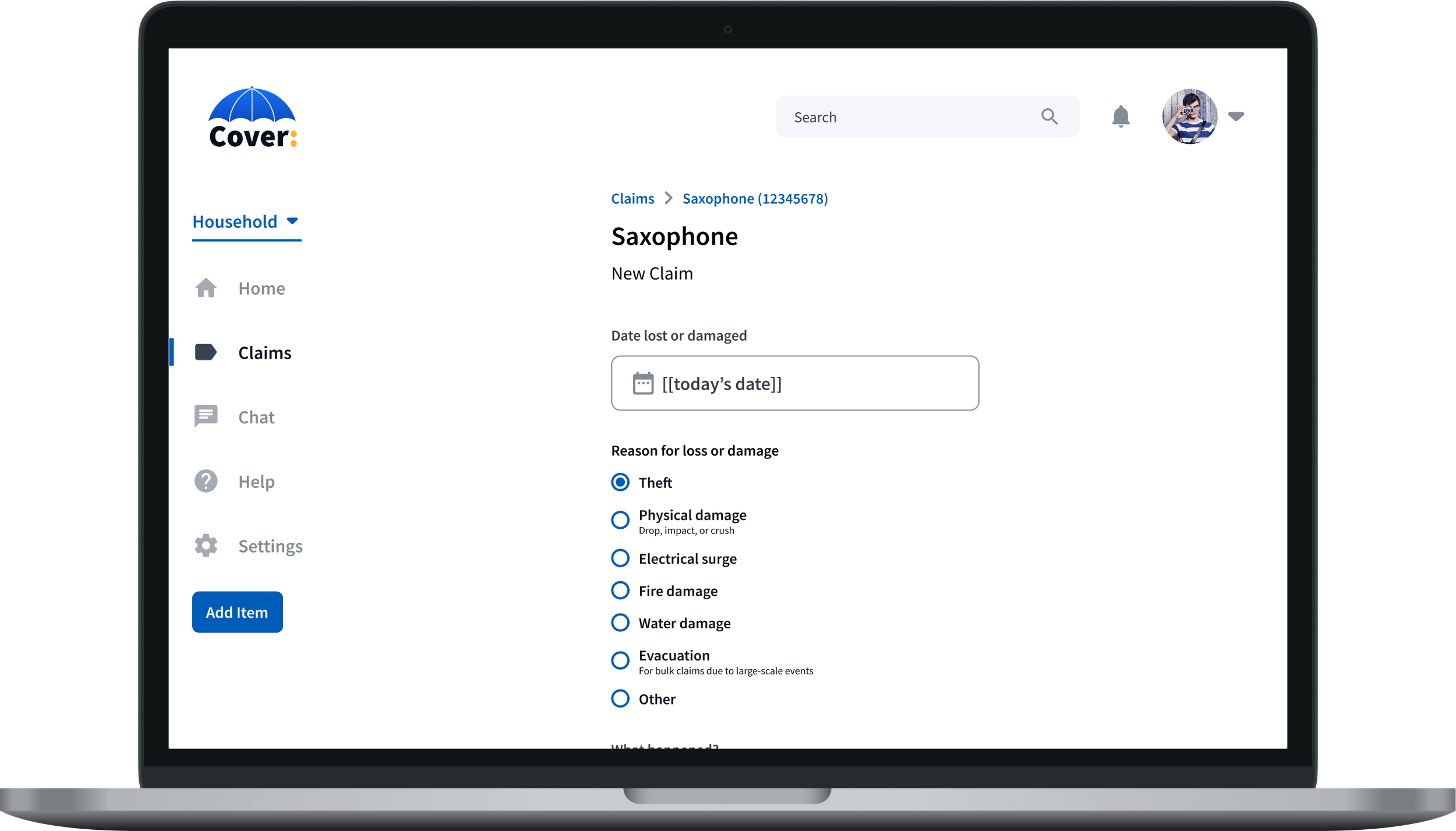
SIL’s design system was in its infancy at the start of this project, so development of the design system and the Cover application happened simultaneously. I played a key role in creating design system components based on Material Design standards.
Because the design team on this project was small (just two people), we focused on creating high-fidelity, but not pixel-perfect, mockups in Figma.
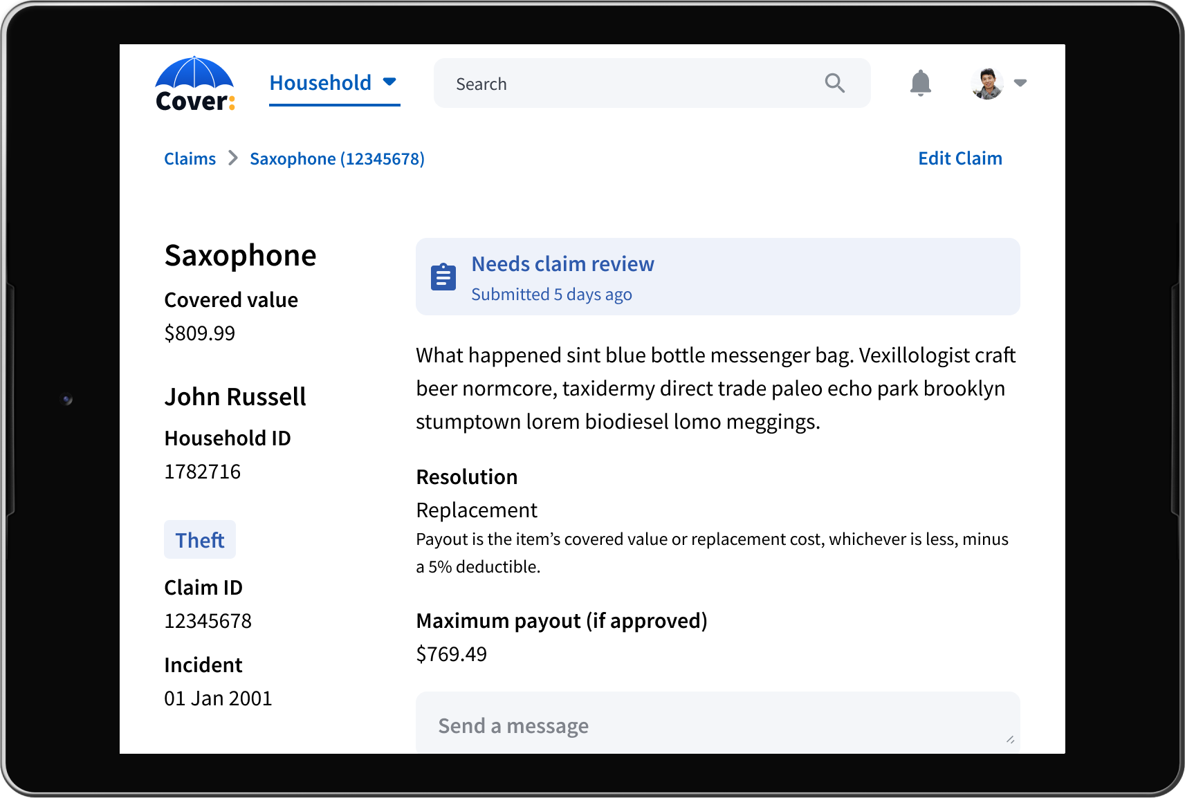
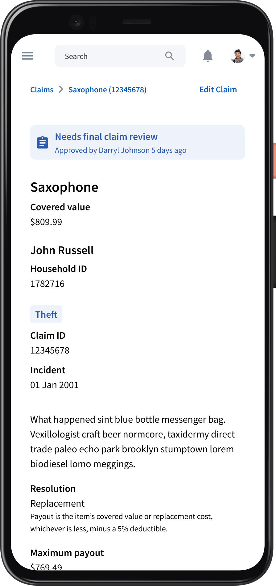
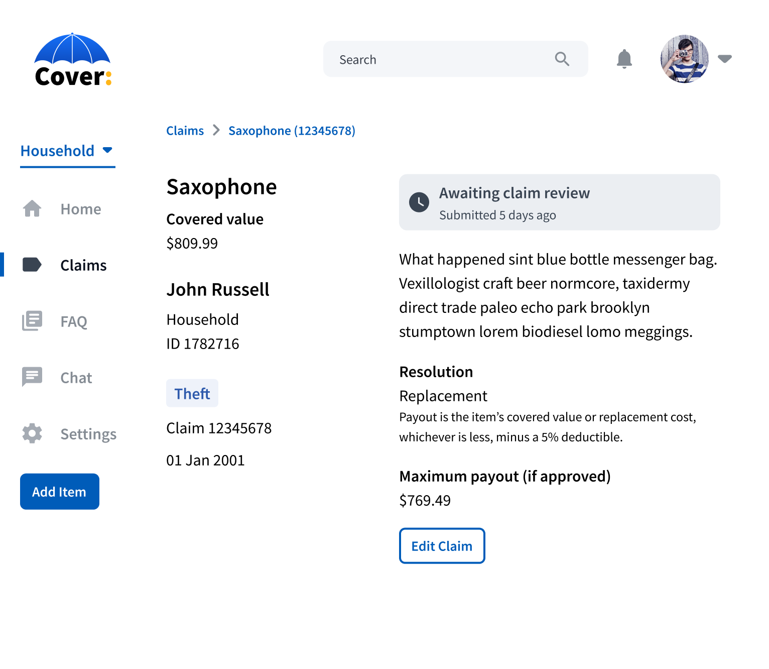
We designed for three different categories of screen size—desktop, tablet, and mobile.
The primary difference between screen sizes was the navigation layout. On desktop, we used a sidebar which collapsed for a tablet screen size. To make sure the policy selection dropdown is accessible at this screen size, we moved it to the top navigation. Users on mobile devices can use a hamburger menu to access the contents of the sidebar. Other elements are also responsive to ensure usability across all screen sizes.
One of the most complex flows in the application—and the one I spent the most time on—is to file a claim.
Within the Cover plan, there are a number of different possibilities to resolve a claim—repairing or replacing the item, then later getting reimbursed, or simply receiving the item’s fair market value for the loss. Different options are available to the user depending on the event and the value of the item. To make the logic of the claim options more clear, I distilled the claim process into a flowchart to show the options that would be available in different situations.
Initially, we planned to create an interface that would allow people to file claims for multiple items at once.
This would be particularly helpful for policies held by parts of the organization itself because they manage a much larger number of items.
Multi-items claims ended up being pushed to a future release.
Since the vast majority of claims were for only one item, we decided that our time designing and developing a multi-item claims form was better spent elsewhere. Multi-item claims are still planned for a future version.
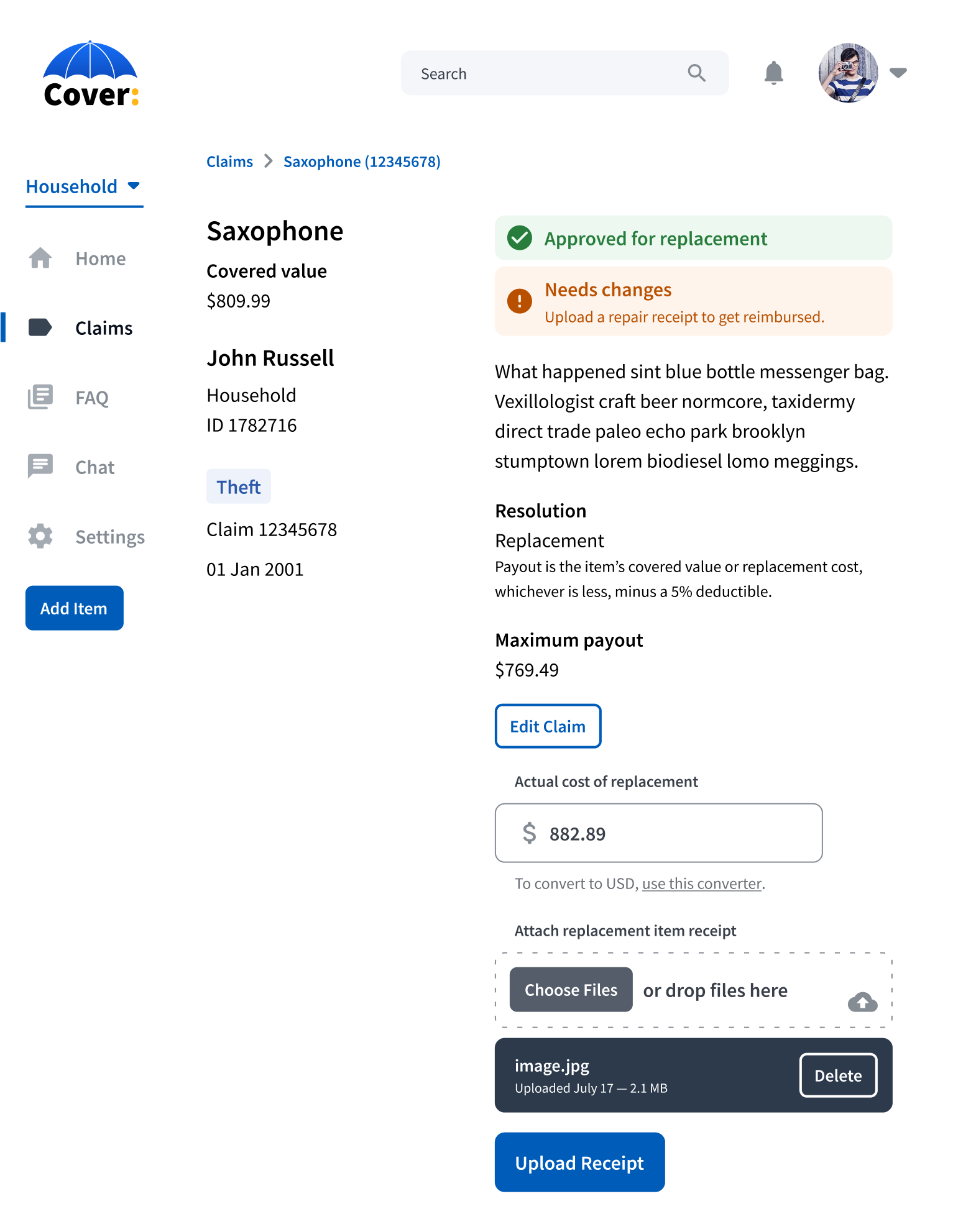
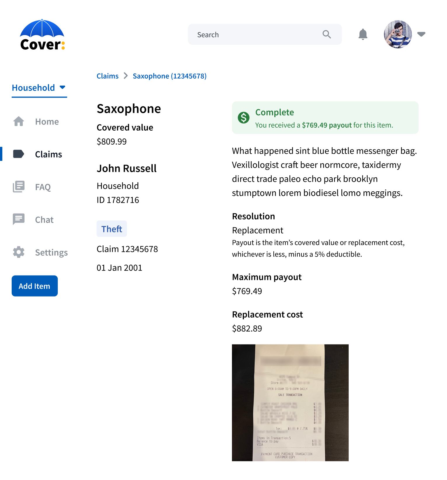
Once the claim is filed, the user needs to be able to follow the status of the claim and stay informed of any actions they need to take.
This might be as simple as uploading a receipt for reimbursement, or it could involve updating the claim because of an error in the initial details form.
Ensuring Scalability
The mutual aid plan is completely self-funded—annual premiums and claim deductibles must cover the costs of all claims.
In designing the new plan, we implemented a number of systems to limit liabilities and ensure the solvency of the mutual aid fund.
Percentage-Based Deductible
Under the existing plan, annual premiums are calculated by a flat percentage and claims have a flat deductible per event. An expensive item has a much smaller deductible percentage-wise than a less expensive item. In the new plan, this is changed to a percentage-based deductible. This both enables policyholders to cover less expensive, but still important, items at a more reasonable cost and helps ensure expensive claims can continue to be covered.
Excessive Claims Deductible
Fraud is not a major concern, since the plan is restricted to employees of the organization. However, for users who file repeated claims, they receive a higher deductible for future claims to limit the cost of covering these claims.
Limited Coverage Categories
Certain categories of items such as musical instruments and medical devices have a cap on their covered value.
War Deductible
If a claim is the result of government action or instability, the deductible is raised to 33%.
Conclusion
With the initial design phase completed, I worked with the development team to implement Cover as an application. I presented designs to the team, making sure my work was clear and understood by everyone. Using Storybook, I adjusted element styles to make coded components match design specifications while balancing our limited resources.
Cover started a gradual, as-needed release in November 2021. That gave us room to discover UX and technical problems without overwhelming our staff. This week, May 2022, we’re promoting Cover organization-wide.
This article is reposted from karlnippoldt.com. Shared with permission.


